
In short
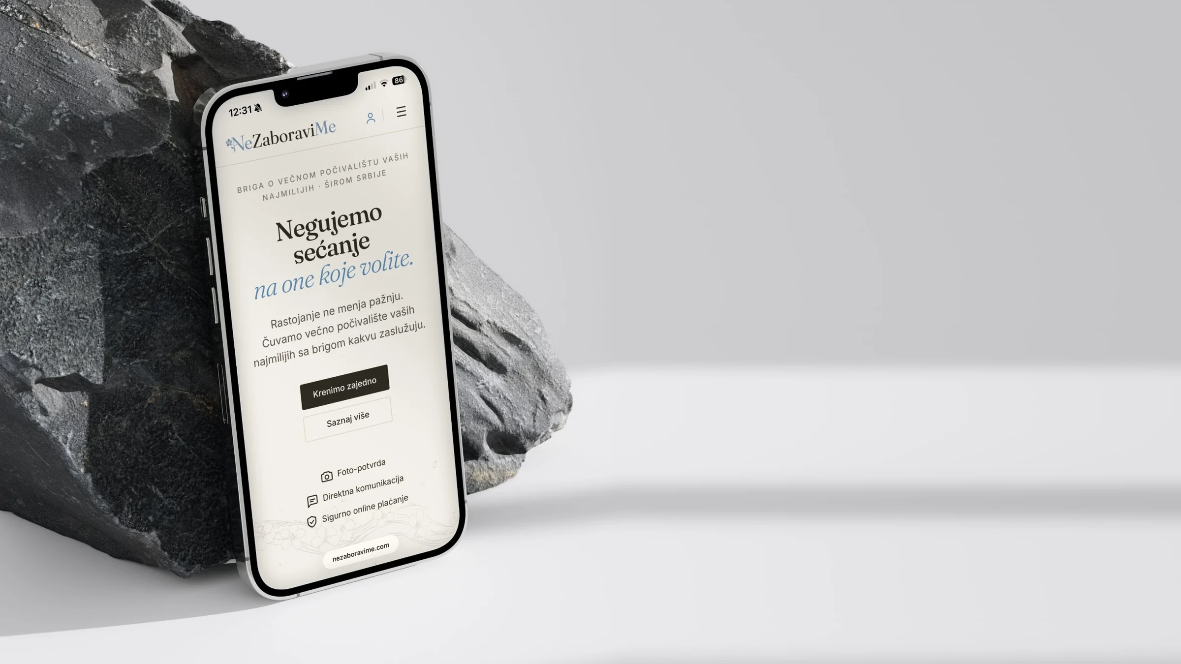
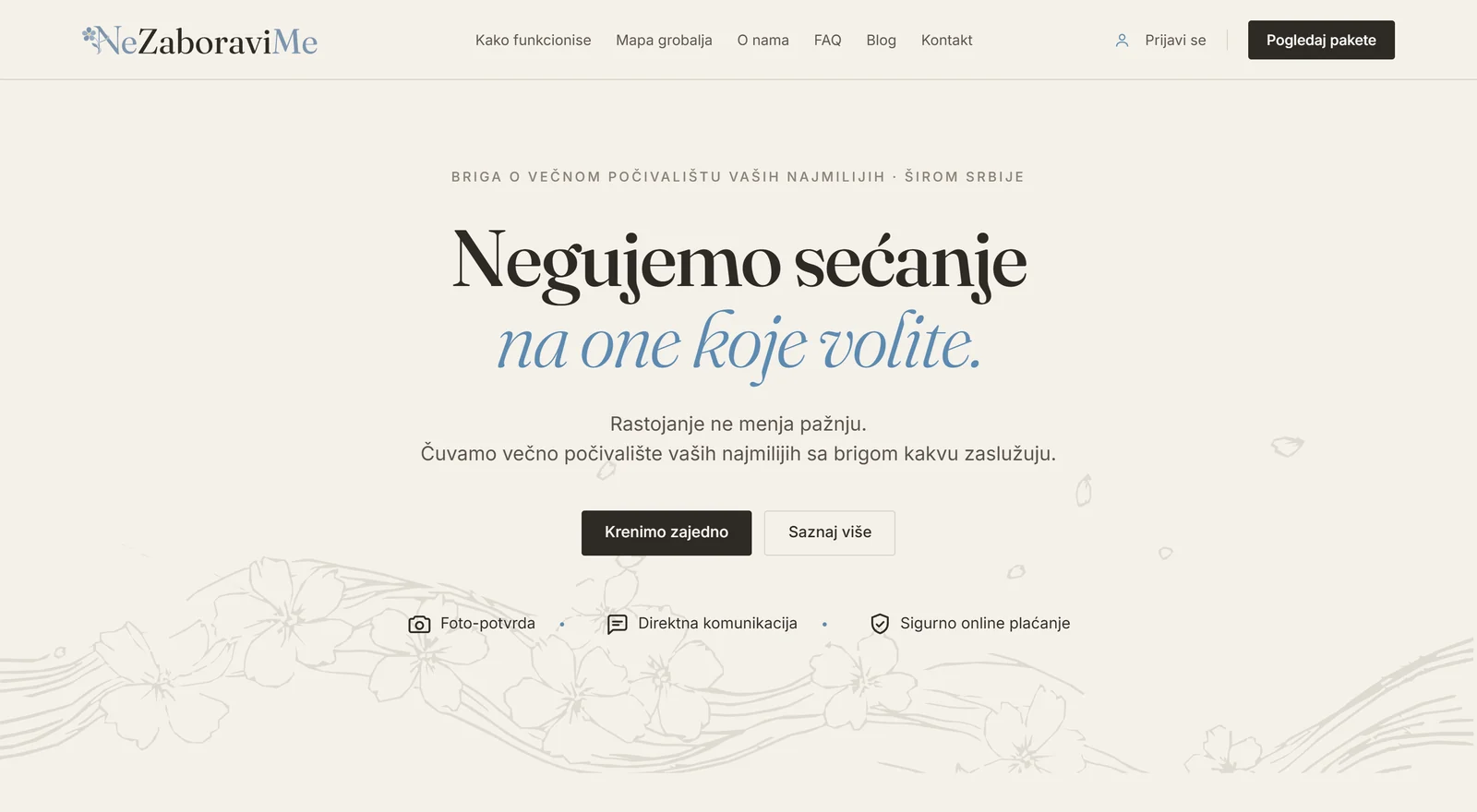
Ne Zaboravi Me (Serbian for “forget me not”) is a platform for ordering grave care and maintenance anywhere in Serbia. On the website a customer picks the cemetery and the exact place on a map, chooses a package, pays by card, and after every visit receives a “before and after” photo report in their account and by email.
At first sight it is a website with four packages. In practice it is a system that runs a service business from start to finish:
- the price depends on the location: five zones, calculated from the cemetery’s distance;
- a cemetery database with Google Maps, manual entry and an approval queue for new cemeteries;
- a public cemetery map of all of Serbia, with municipal borders, zones and a search that understands Cyrillic and typing without diacritics;
- annual packages that build a schedule of two or twelve visits from a single payment;
- custom quotes for locations and requests without a fixed price, with a payment link;
- our own card payment integration, with a cryptographically signed payment confirmation;
- one app with two working panels, for the owner and for the field team, that uploads photos even on a weak signal and sends push notifications without an extra SaaS platform.
Everything runs on WordPress and WooCommerce, with no frontend framework, no build step and no separate backend. It is our largest project this year and the clearest example of what we mean by web app development: a website that is not a shop window but the tool the business actually runs on.
The client and the problem
The service is for families who cannot visit the grave of their loved ones regularly, because they live in another city or abroad. In the product conversations the key question was not only “how do I pay”, but how to choose the exact place from far away, know what the service includes and get proof that the work was done.
The client asked the system for five things:
- A clear price up front, although the cemeteries are spread across Serbia and the journey to each one differs.
- Card payment without back and forth, for customers abroad as well.
- Proof of the work: photos before and after every visit.
- An annual service without automatic charges: the package is paid once, and the customer starts the next cycle themselves.
- A business that can grow: more people in the field, while the owner runs everything from a phone.
In this field the tone matters too. The copy, the design and every message had to be quiet and dignified, with no pushy sales language.
Challenges
- A price per location. The packages are fixed, yet the same service costs more the further away it is. The customer has to see the exact price before paying, and for remote locations the system has to switch to a quote.
- A location that is not an address. A grave has no address. The system needs the cemetery as a shared record and an exact pin of each customer’s place, so that one customer’s data is never visible to another.
- Cemeteries missing from the database. No database covers every cemetery in Serbia. Customers have to be able to add a new one while the database stays clean.
- A service, not a product. WooCommerce thinks in products and shipments. Here one payment means two or twelve visits over a year, with deadlines, people assigned and photo reports.
- Card payments in Serbia. The chosen connection model needed our own integration, handling approved and declined payments, errors and repeated messages.
- Work in the field. The team works at cemeteries, often on a weak signal, from a phone. Photos must never get lost, and the owner has to know where they were taken.
- The client’s constraints. No change of platform, no build process, no expensive services and no complicated maintenance.
Our approach
- One system, no new infrastructure. The public website, the customer account, payments, operations and the team app all live in the same WordPress. The theme is plain PHP, CSS and JavaScript.
- The server is the source of truth. Price, zone, data ownership and payment status are always checked on the server. The browser only displays them.
- No promises the system cannot keep. A payment counts as successful only with a verified signature. Payment is not the end of the service: the cycle stays open while visits are still to be done.
- Content and settings belong to the client. Texts, prices, zones, logos and switches are edited in the admin, with no developer needed.
- Everything can be undone. Features not in use right now, such as payment in euros or extra payment methods, are switched off, not deleted, so they come back without new development.
A price that depends on the location
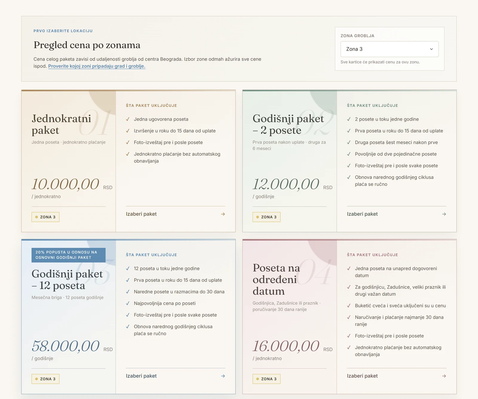
Zones are calculated from the straight-line distance between the cemetery and the centre of Belgrade, with radii the owner sets in the admin. A cemetery or a city can also have a zone assigned by hand. Zones 1 to 4 have fixed prices, and zone 5 automatically switches to a quote.
- The price is for the whole package, not per visit, and it is always confirmed from the chosen location before payment.
- The public price preview, the checkout, quotes and renewals all use the same algorithm. There is no duplicate logic in the browser that could show a different price.
- Four services: a one-off visit, an annual package with 2 visits, an annual package with 12 visits, and a visit on an exact date (an anniversary, a memorial, All Souls’ Day), with a small bouquet and a candle.
- Packages with their own identity. The client did not want five identical cards told apart by a coloured line. We designed four packages with artistic accents and a separate block for special requests, aligned at every screen width.
- A price preview by zone, on the spot. The customer picks a zone and every card immediately shows the price and a zone tag in that zone’s map colour, with no round trip to the server.
Cemetery, resting place and visit
The system keeps three ideas apart that are easy to mix up:
- Cemetery: a shared catalogue with the cemetery’s centre, city and zone.
- Resting place: the exact place of a specific customer, a grave or an urn, with a pin, the name of the deceased and a description of the spot. Customers see only their own records; the owner and the assigned team member see what they need for the job.
- Visit: the service carried out for a given payment, resting place and date.
The Google map loads only once it is actually on screen, with the database’s own cemetery markers and a search for nearby cemeteries. Choosing a cemetery is a phone-friendly search grouped by city instead of a long dropdown, with a “My cemetery is not on the list” option. A customer’s manual entry becomes a suggestion: similar suggestions are grouped, and the owner approves them, merges them with an existing cemetery or rejects them. The cemetery’s centre is kept apart from the customer’s personal pin, so linking to the database never moves anyone’s grave.
The cemetery map: an idea from our own brainstorming
The map came out of our internal brainstorming on how to answer a remote customer’s question fastest: “do you come to my cemetery, and which zone is it in?”. The client liked the idea, so we developed it into a tool for finding a cemetery rather than an illustration of coverage.
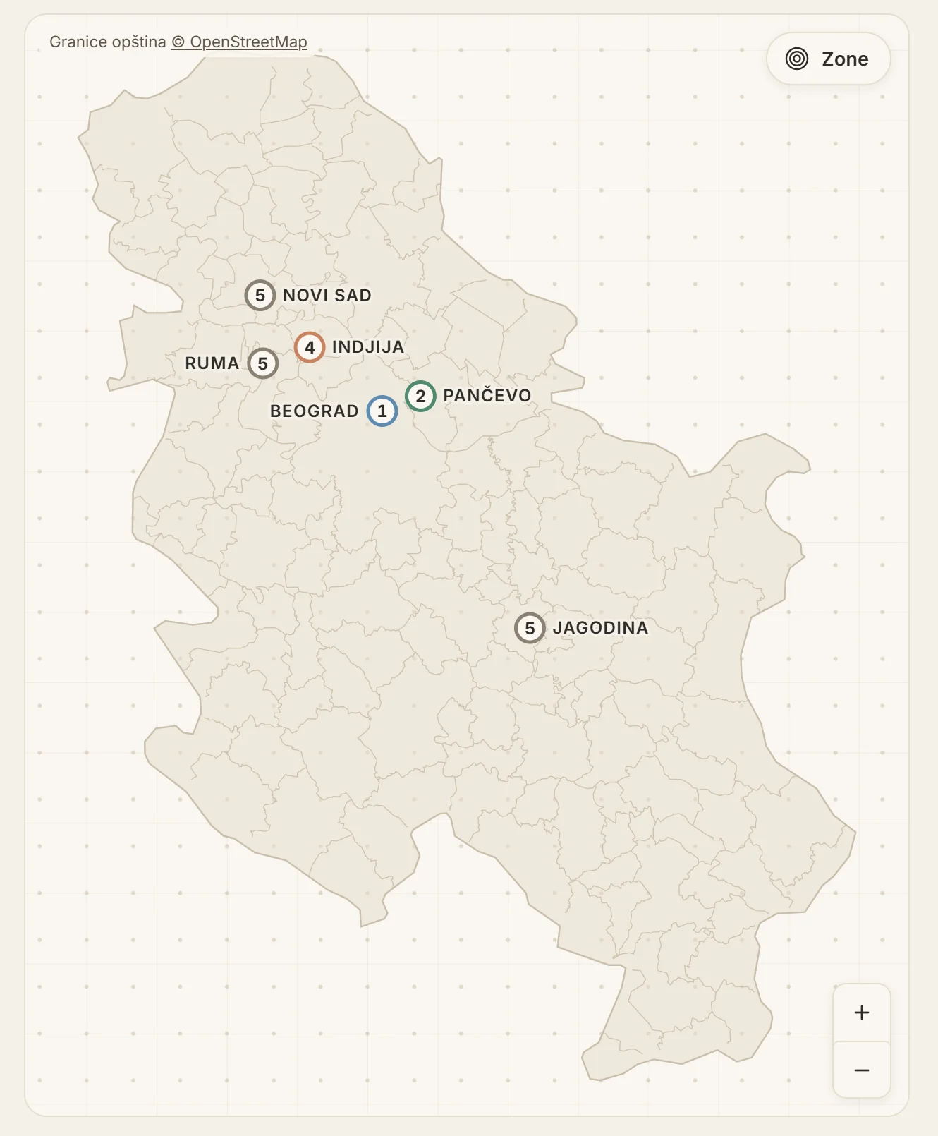
- No Google Maps on the public map. The map is our own SVG: a hand-drawn outline of Serbia and a projection calibrated against known cities. The public page makes no API calls and costs nothing per view; the Google map stays only where an exact grave pin is needed.
- 145 municipalities in about 12 KB. The municipal borders come from OpenStreetMap open data, mapped into our map’s projection. A border shared by two municipalities is drawn only once, and the layer loads after the page is shown.
- The number in the circle is the zone, in that zone’s colour, the same as on the packages.
- The search understands how people type: without diacritics (“pancevo”), in Cyrillic (“Земун”) and with “dj” for “đ”. For customers abroad with foreign keyboards that makes all the difference.
- Labels keep their size at every zoom level. The layout finds a place for each name so that none overlap; when there is no room, a less important name gives way and the marker stays.
- One finger scrolls the page, two move the map. On a phone the map never traps scrolling, and at rest it does not use the processor.
- From the map to a price in two clicks. Pick a cemetery, then “See the packages”, and the prices are already for the right zone.
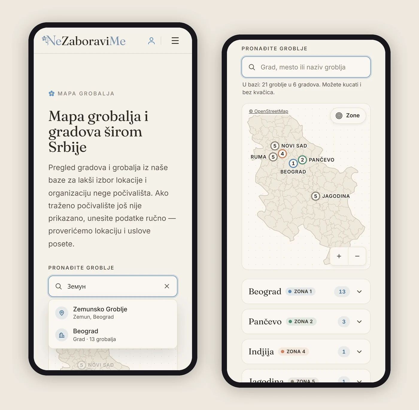
The map is a guide: the borders are simplified, and the price is always confirmed by the chosen resting place. Municipal data © OpenStreetMap contributors, credited on the map itself.
Buying without a cart
- The cart is only a technical step. One service, quantity one, no cart icon and no cart page. Choosing a package leads straight to checkout.
- Checkout as a guided flow: sign in or register, then pick an existing resting place or add a new one on the map, extra requests, details, agreement to the terms and the card.
- Custom quotes. For zone 5 and special requests the system records the request without charging. The owner enters a total and a note, the customer gets an email with an “Accept the quote and pay” button, and the payment goes through the same flow with an ownership check. Visits are created only after payment.
- Different promises, not just different prices. A standard first visit is scheduled within 15 days of payment, while a visit on an exact date has to be chosen and paid at least 30 days ahead. That difference travels from the catalogue to the task in the field.
- Renewal without automatic charges. Thirty days before an annual package expires, “Renew package” appears in the account: the same resting place, the same package, at the current price. The owner can also switch on email reminders.
Card payments: our own integration
This is the most demanding technical part of the project. For the chosen connection model we built an isolated plugin that takes the customer to the bank’s secure payment page. The customer never enters the full card number or security code on our site, and the site never stores them. Visa, Mastercard, Maestro and DinaCard are accepted.
- Every attempt has its own reference, separate from the service number, so a repeated message about the same payment is told apart from a new attempt.
- Request and response are cryptographically signed (HMAC-SHA256), verified in a way that resists timing attacks. The keys are not in the database but in the server configuration.
- The server confirms the outcome, not the browser. The confirmation reaches the server directly, whatever the customer does in the browser. A thank-you page or an unsigned return never confirms a payment.
- No double payments. A database lock and recovery of interrupted processing stop a repeated confirmation from creating a second visit schedule. Suspicious cases go to a manual check instead of being accepted automatically.
- A payment confirmation on the thank-you page, in the account and by email, with all the required details and a clear note that it is not a fiscal receipt.
- The admin has a read-only view of payment attempts, with no dangerous “mark as paid” button.
We ran the planned scenarios for approved and declined payments, system errors and duplicates, along with isolated tests of signatures, amounts and repeated processing. For every test purchase we also checked the state of the service and that its visits were created, not just the success message.
The confirmation that never arrived: two walls in front of the site
Payments went through, but the server never received the confirmation of the outcome. The cause was two independent layers of protection: the hosting checked whether the visitor was a bot (and the confirmation is sent by a server, not a person), and behind it Cloudflare blocked the same request. The fix was not to switch protection off for the whole site. We made two narrow exceptions for the one address that receives the confirmation, and the real security still comes from the signature on every message. The final test: the service moved to processing while the customer was still on the payment page, before they ever returned to the site.
The displayed price must not change the amount charged
Early testing showed that the setting for displayed decimals affected the amount sent for payment. We separated the two rules and added a test that checks the same amount whatever the display. The lesson: checking the price on screen is not enough; you have to check the amount the system actually sends.
One payment, many visits
This matters more than the number of packages. Payment, a single visit and the annual cycle each have their own state, and no single “done” button merges them:
| Event | What the system does | What is not finished yet |
|---|---|---|
| A request without a final price | Records the location and scope, waits for a quote | No charge and no visit schedule |
| Payment confirmed | Opens the service and creates the planned visits | The work in the field is not done by this |
| The team member sends before and after photos | Hands the visit to the owner for approval | The customer does not see the report yet |
| The owner approves | Publishes the report and marks the visit done | The other visits of an annual package stay open |
| No open visits left | Closes the cycle if at least one visit was done | Cancelled visits are never shown as done |
| Renewal | Links the new payment to the same resting place at the current price | No automatic card charge |
The customer account and photo reports
- Planned visits grouped by payment, with a number (for example 3 of 12), a deadline and a state.
- Before and after photo reports with a gallery; the email brings the photos as attachments and a link to the account.
- The language of a service, not a shop. The customer never sees “orders”, but “services”, “request”, “quote” and “visit”, each with a clear meaning. The messages “your choice is received”, “payment is confirmed” and “all visits are done” are never mixed up, so a friendly tone never hides the real state.
- Sign in and registration in the site’s own design, with email confirmation and a resend link that does not reveal whether an account exists.
NZB Panel: one app for the owner and the field team
This is what turns the project from a web shop into a platform. NZB Panel is a PWA, an app added from the website to the phone’s home screen, without the App Store or Google Play. After signing in, the owner sees the Management panel and a team member sees the Field panel.
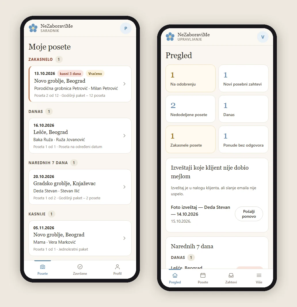
The panel for the field team
- Assigned visits grouped by urgency: overdue, today, the next seven days, later. Within a group they are sorted by cemetery, so trips are easier to combine.
- A visit page with navigation (the grave pin, then the cemetery centre), a reference photo from the previous visit and a clearly described task.
- Photo uploads on a weak signal. The phone reads the time and GPS from the original, shrinks the photo and keeps it on the device before sending. It sends two at a time with a progress bar, resumes when the connection returns, and never creates a duplicate.
- The server checks the real file type, size and dimensions, and the customer does not see the photos until the owner approves them.
The panel for the owner
- A daily overview: visits awaiting approval, new requests, unassigned, today’s and overdue visits, quotes without an answer, and reports whose email to the customer failed, with a resend.
- Approval with location data. Each photo shows its author, time and distance from the grave, with a warning when something does not match. The owner approves or sends the visit back with a reason.
- Assigning many visits at once, changing dates and cancelling.
- Special requests and quotes from the phone, with a payment link.
- A small CRM: team members (invited by email to set a password, which is never sent), services with search, and clients with their history.
- Package renewals and statistics: visits done, deadlines met, revenue by month and results per team member.
- Approval of new cemeteries with a satellite view.
Under the hood
- Push notifications without a SaaS platform. We wrote Web Push in PHP (VAPID, encryption per RFC 8291, ES256 signature) and checked it byte for byte against the official test vector. Team members are notified when a visit is assigned or sent back, the owner about a new request, a payment and photos to approve. Delivery is still done by the browsers’ push services, with the phone’s permission.
- Measured offline support. The app keeps its interface and an offline page, and photos wait on the device until they reach the server. Client lists, server responses and galleries are not stored on the phone, so the app never promises offline work it cannot deliver.
- Sign in inside the app, because iPhone keeps an installed app’s cookies apart from the browser’s.
- A “Get the app” page for less technical users: one button on Android, and on iPhone a step-by-step guide with annotated screenshots.
Card acceptance rules and legal content
A website that accepts payment cards has to meet clear rules on content, logos and confirmations. We implemented the terms of business from the client’s document (with the company details corrected from official sources), the privacy and cookie policies with our own consent panel, the contract withdrawal form and the payment confirmation. The card logos are unmodified original files, laid out as the reference examples require: one row on a computer and three centred rows on a phone, checked at ten screen widths. The footer shows only what is active.
Emails in Serbian, from the right sender
A review of every email the system sends showed that the WooCommerce emails went out in English. Now they are all in Serbian, in a branded wrapper that fits a phone screen, with the logo as a PNG because Gmail and Outlook do not show SVG. The “payment confirmed” email goes out only with a confirmed transaction. Publishing a report and sending its email are separate steps: if sending fails, the report stays in the customer’s account and the owner sees it on a list to resend.
Speed, caching and SEO
- Speed on phones was one of the main goals: WooCommerce styles load only where needed, the decorative element that was the largest on screen became an inline SVG, and the fonts are self-hosted, subset to Latin with the Serbian letters only.
- A cache with rules for a service shop. Checkout, the account, the panels and the payment confirmation are never cached, and the cache lifetime matches the security tokens in the forms.
- Deliberately against thousands of thin pages. Instead of mass-generated pages for every city and cemetery, one good cemetery map. Google does not reward thin, repeated content, and a customer does not need a thousand near-identical pages.
- Structured data and GEO. One schema graph (organisation, service, FAQ, contact, the map as a collection) and copy that answers straight away, with no invented reviews or statistics, so that AI search engines quote it accurately too.
- Private stays private. Resting places, reports and customer locations are kept out of the sitemap, the public API and the schema graph.
The cache that “remembered” a package
After the move to a new cache, customers reached checkout with a package they had chosen earlier, or with an empty cart. The cache had stored a redirect that changes the cart behind the scenes. The fix was a rule that no redirect and no state-changing request is ever cached, confirmed with real sessions: package 2, then 1, then 1, then 2.
Security
- The full card number and security code are never entered on the site.
- An ownership check and request forgery protection for every change of data: resting place, report, service and visit.
- The Owner and Team member roles have only the rights they need, with no access to the WordPress admin.
- Security headers, spam protection and rate limits on sensitive forms; usernames are not exposed through the API.
From development: three stories
“Is this photo really from that grave?”
The owner cannot visit every location. So next to each photo the app shows the available capture time and distance from the grave, with the source of the data, and warns when a photo looks like it was taken on another day or far from the grave. GPS is an aid to the decision, not infallible proof, and the decision stays with the owner. The value is that a suspicious or incomplete detail is seen before the report reaches the customer.
A number on the map that must not get the zone wrong
On a phone, the markers for Belgrade and Pančevo sit too close together. The usual fix, merging them into one marker, would put “1-2” next to Belgrade, and a customer would read that as “Belgrade is in two zones”. So only cities of the same zone are merged, and different zones are nudged apart, with a thin line to the real location. If a name has no room, the name gives way, never the number.
The decoration that kept a phone’s processor busy
The home page got an animated decoration: a swaying cherry blossom branch with falling petals. We split it into a light part (the petals, inline in the page) and a heavy part (the swaying branch, loaded after the page is shown and only on larger screens). The petals still kept a slower phone’s processor fully busy. The cause was one old rule from the theme’s starter base that made the browser re-apply the whole stylesheet to every animated element on every frame. One narrow rule brought the load down to practically nothing. The lesson: measure an animation on the real page, not only in isolation.
How we checked it
Automated browser tests at five screen sizes, separate tests for flows that change data (registration, payment, contact) and isolated PHP tests for every part: payment signatures and amounts, quotes, renewals, the panels, push and emails. We open and review screenshots from 320 to 1440 pixels, and measurements check overflow, tap target size and alignment. Every change on the server goes with a backup and a check that the file on the server is exactly the one we sent.
Outcome
- The whole service cycle in one system: choosing the location, the price, payment, the visit schedule, field work, approval, the photo report to the customer and the renewal reminder.
- The owner runs the business from a phone, without the WordPress admin.
- No separate SaaS subscription for the panel, push notifications, the photo queue or cookie consent. Hosting, maps and payments have their own costs; the project is not cost-free, but it carries no subscriptions it does not need.
- All on standard WordPress hosting, with no build process, and a theme the next developer can read.
- Google’s speed test on a phone: 99/100. The home page’s main content shows in 1.4 s, and the layout barely moves while the page loads. Measured with PageSpeed Insights on 12 November 2026, on an emulated phone over slow 4G; accessibility 97, best practices 100, SEO 92. It is a lab test: Google has no real-visitor data yet for a site this new.
- Launched publicly on 2 November 2026.
What we are still tracking
The platform has only just started, so we do not invent business results in advance. After the first months we will add the visits and photo reports completed, the time from payment to the first visit, speed from real visitor data and the share of customers abroad. The renewal rate of annual packages can be shown only once the first cycles come up for renewal.
Technologies
| Layer | Technologies |
|---|---|
| Platform | WordPress, WooCommerce, ACF |
| Theme | Custom theme: PHP, CSS with tokens, vanilla JavaScript, no build step |
| Payments | Our own WooCommerce payment gateway, HMAC-SHA256, payment confirmation on the server |
| Maps | Google Maps JavaScript API and Places API; our own SVG map of Serbia with municipal borders (OpenStreetMap) |
| App | PWA: manifest, service worker, IndexedDB, Web Push (VAPID, RFC 8291), REST API |
| Background jobs | WooCommerce Action Scheduler for reminders and renewals |
| Speed | LiteSpeed Cache, Cloudflare, self-hosted subset fonts |
| SEO | Yoast SEO and our own schema graph |
| Testing | Playwright, Lighthouse, PHP tests |
| Design | Figma |
Timeline
| Period | Phase |
|---|---|
| July 2026 | Design in Figma, visual identity, theme, customer account, resting places, Google Maps, zones and prices |
| August 2026 | Cemetery database and approval queue, cemetery search, planned visits and quotes, packages with their new identity |
| September 2026 | The model without automatic charges, development of our own card payment plugin |
| October 2026 | Payment testing, card acceptance rules, NZB Panel for the owner and the team, push notifications, emails in Serbian, the new cache and the new cemetery map |
| 2 November 2026 | Public launch |
Running a service business that should work online?
If your business is not “a product in a cart” but a service with locations, deadlines and people in the field, your website should not pretend to be a shop. We would be glad to look at how you work and suggest what really belongs in the system.